Books in Production, Coin Designs Incoming
8 days ago
– Fri, May 29, 2026 at 08:22:04 PM
Greetings Backers!
TL;DR: You have five days left to pledge to Doodling as a Hobby. Howard has been working on Bonus Stories for Sergeant in Motion. In June / July we'll work on two coins and the sketch cards. The bulk shipment of books is expected at the end of July or first week of August. Your next update will be week of June 22-25.
Details
Doodling as a Hobby has only one week to reach some important stretch goals. We've unlocked expanding the book, but we really want to be able to print in color and we can only do that if enough copies are ordered.
We're at about 562 copies sold and we need 38 more. So if you're thinking about picking up this book, please pledge today! CLICK HERE TO BACK THE PROJECT (We've got some other cool stretch goals as well, so click over and read all about them.)
Function of Firepower Updates
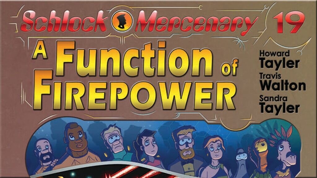
The latest word from our printer is that A Function of Firepower is in production. Sometime soon we'll get a photograph of progress. The plan is to ship 40 copies to us by air so that we're sure to have them in hand for Gen Con. The remaining bulk shipment should arrive right about when we depart on our annual Gen Con road trip. (Might be the week before, or the week after, depending on freight and customs.) If we're away when the shipment arrives, warehouse manager Aidan will receive the shipment and will even begin working on set up for shipping. The exact timing of shipping will depend on when Howard can sign all the books and when sketch editions can get rolling.
As we said in the last update, Howard is spending May writing prose. Mostly this has meant working on scripts for the Sergeant In Motion bonus stories. Once we hit June we'll turn his attention to designing the remaining two coins and to beginning work on the 100 sketch cards that need to be complete. Ideally we'll have coins in hand and sketch cards done before the bulk shipment arrives.
That's our update for now. Your next update will be week of June 22-25.
Thanks for backing our project!
Howard and Sandra Tayler
Announcing DOODLING AS A HOBBY! A Function of Firepower PDF now available!
about 1 month ago
– Wed, May 06, 2026 at 03:37:11 PM
Greetings Backers!
TL;DR: We have a new project available Click here back DOODLING AS A HOBBY: THE RETROSPECTIVE SKETCHBOOK OF AN ACCIDENTAL CAREER. If you have a PDF version of A Function of Firepower in your order, you should have gotten an email from Backerkit with a link to download it. You can also login here: Backerkit Login and look for the link on your confirmation page.
We're very excited to announce our newest project: Doodling as a Hobby: The Retrospective Sketchbook of an Accidental Career.
(Cover not final!)
At the time of this writing the project is 60% funded. It is a solid start for the first 36 hours, but we'd really love to hit funded before the end of the first week. You can help us do that by backing it or by spreading the word to others. You can find more details about the project here!
A Function of Firepower PDF
Check your mailbox for the link from Backerkit to download your PDF copy of A Function of Firepower. When you get there, you'll see two versions. Sandra discovered a small error on the HESH page and corrected it for the update. If you're having trouble accessing your copy, please email [email protected] and Sandra will assist.
Your next update will be the week of May 25-29.
Thank you so much for backing our project
Howard and Sandra Tayler
Off to print! (and next steps)
about 1 month ago
– Fri, May 01, 2026 at 06:53:13 PM
Greetings Backers!
TL;DR: A Function of Firepower is done! The printing process will take about three months, so we expect to have books late in July. The PDF will be sent out to backers by the end of next week. Howard will spend May mostly working on prose projects, but he'll also start work on the JPL and HESH coins. It is also possible he'll begin drawing sketch cards. A full Deliverables Report is below. We're launching a new project soon: Click here to learn about Doodling as a Hobby. Your next update will be the week of May 25-29.
Deliverables Report
Core Items
- A Function of Firepower PDF - You should have this by the end of next week.
- A Function of Firepower perfect-bound glossy soft-cover - Off to print!
- A Function of Firepower sketch editions - We'll start these once we have books in hand.
Add-ons
- Full-color sketch cards - Working on these is one of the options for May
- Limited Edition “Ancient Earth” Print - Ready for test print
- Coin: Not My Circus Not My Monkey - COMPLETE!
- Coin: Jumpstar Prime Lyceum - Waiting for design
- Tough's Logo Pin - COMPLETE!
- Limited Edition Mission Patch - COMPLETE!
Exclusives
- HESH Coin, Series 3 (for HESH pledge level backers) - Waiting for design
Digital Goodies
- Desktop + mobile wallpapers: FoF Cover Art, Ancient Earth, Illustrated Maxim 52. COMPLETE!
Details
A Function of Firepower is complete! Howard finished the last bit of bonus story only hours ago. We're going to spend the weekend double checking everything and then we'll submit files to our printer. From file submission to delivery of books is around three months, so that means end of July for delivery. One of the big questions we have is whether the shipment of books will arrive in time for us to have them at Gen Con. We should hear back from the printer about this on Monday. If necessary we can have a small number of books shipped air freight, but the cost on that is pretty prohibitive.
Having this book done is a huge sigh of relief for Howard. It has been the task that occupied all of his working hours for months. In May we want to give Howard the opportunity to work on prose for a time. He has a short story he's under contract for, chapters to write for a co-authored craft book, and a head full of ideas he'd like to put on the page. We want him to have time to play with all of that. If he has art cycles after he's spent time with prose, we'll have him work on the JPL coin, HESH coin, or sketch cards. He may also spend some time drafting the bonus stories for Sergeant in Motion. We'd really like to get ahead of the curve for that project.
Sandra's time in May will largely be occupied with running the crowdfunding for Doodling as a Hobby: A Retrospective Sketchbook of an Accidental Career. We need this project to help us fund a reprint of Resident Mad Scientist (we only have 180 copies left) and to help pay bills so that Sandra can focus more on our business and less on freelancing.
That's our update for now! We'll be back to update you on progress during the week of May 25-29.
Thanks for backing our project!
Howard and Sandra Tayler
Last Call to Check Your HESH Name!
about 2 months ago
– Mon, Apr 20, 2026 at 08:32:02 AM
This post is for backers only. Please visit Kickstarter.com and log in to read.
Please Check Your HESH Name!
2 months ago
– Mon, Apr 06, 2026 at 04:52:13 PM
This post is for backers only. Please visit Kickstarter.com and log in to read.